Category: Advertising, Branding, Business Cards, Design for Print, Facebook Profile Images, Graphic Design, Logo Design, Photo Retouching, Signage
Adapt Design were recommended to Ortac by the lovely peeps down at Optimus Recruitment. After a free consultation we were given clearance to take control of Ortac’s new identity. Our first port of call was to approach the logo.
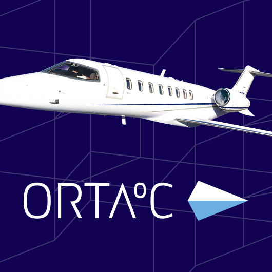
We created two logos for Ortac. You may not notice the difference at first but one has a degree symbol inserted in between ‘A’ and ‘C’. This logo represents Ortac Operations Management Limited and the other logo is the umbrella company. This slight difference is intentional and helps maintain continuity between the two companies.
But that’s not the only subtle difference. When you look at the logo’s icon, what do you see?. You probably see an arrowhead or a simplified plane, and that’s no bad thing. However, it actually represents the Ortac rock, mentioned above, rising out of the sea with its reflection below. We love creating a logo with a hidden meaning. Take a look at their previous logo to compare the two.
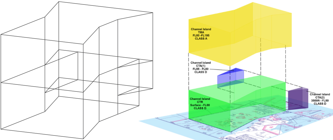
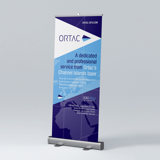
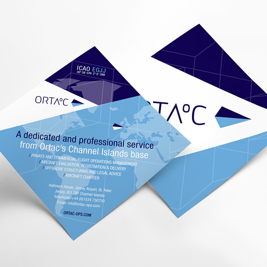
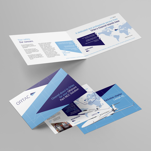
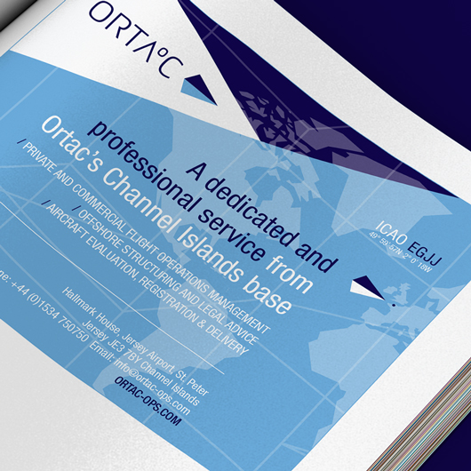
You’ll also notice the marketing collateral features a linear graphic. This is not just a random set of lines. It is derived from a 3D diagram that illustrates Channel Island Airspace
How many times have you been handed a flimsy business card? What does that say about the person that gave it to you or the business they work for? It’s like a limp handshake. Maybe they wanted to save a couple of quid, or they don’t take pride in their business identity. I’ve even had some people say they are too embarrassed to hand me their card after seeing mine! Take a look or I’d be more than happy to hand you one in person.
Your business card reflects the personality of your Company. So why would you want to compromise it from the get go? Ortac love their business cards and they are proud to present one whenever the opportunity arises.
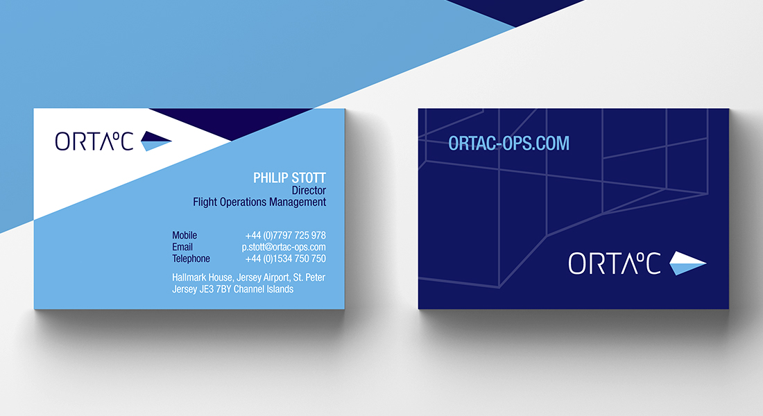
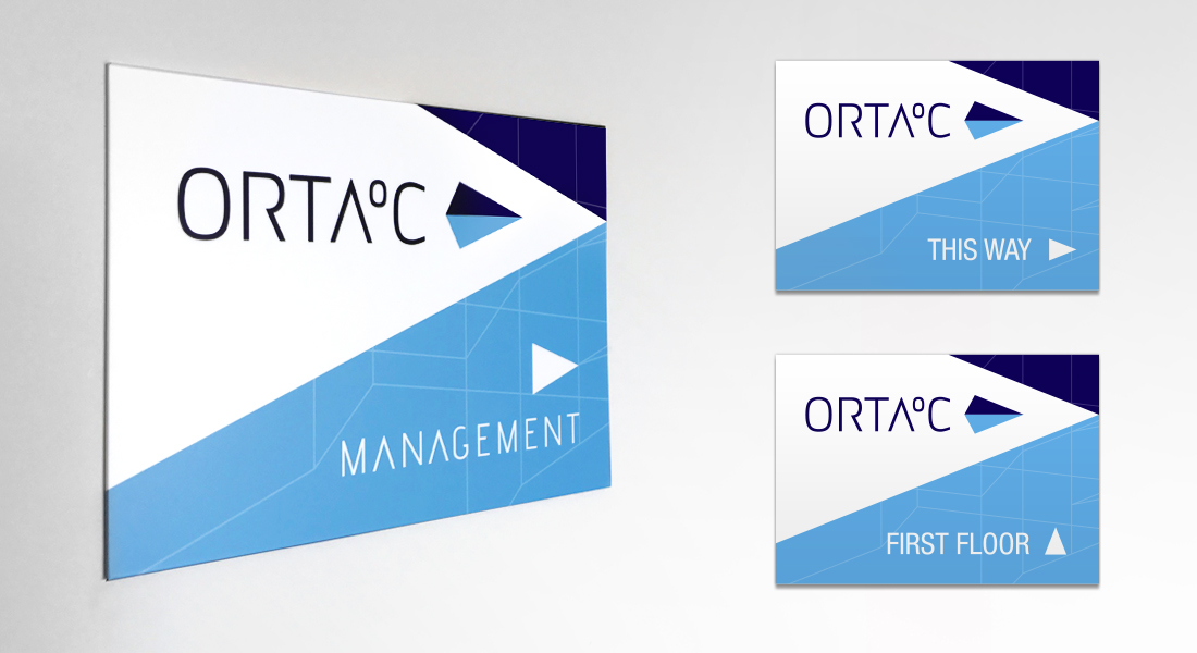
As well as the linear graphic, we also introduced a stylised world map with their icon featured as a location beacon. The design template provides a safe zone for the logo, as well as portraying the Company in a positive light with the primary use of upward angular design.
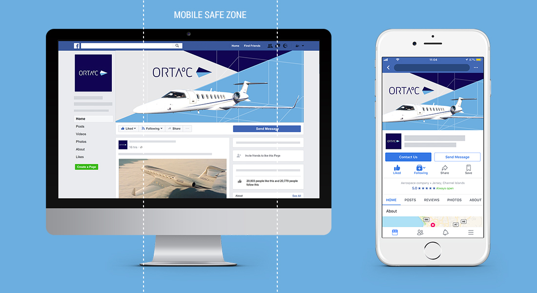
And let’s not forget about social media. It’s important to allow for the safe zones here as well.