Category: Branding, Business Cards, Copyright Protection, Fleet Livery, Graphic Design, Letterhead, Photo Retouching, Signage, Website Design
Brenwal realised that over the years their identity, noticeably their website and vehicle livery, was a little disjointed and required attention to reflect their professional approach.
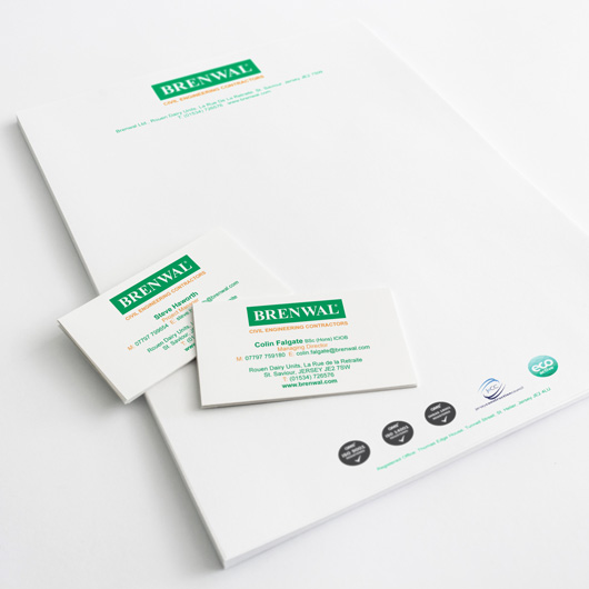
We put our spade in the ground and started with a colour palette. The brightness of their primary colour (green) was toned down allowing for more consistent reproduction across all mediums. Did you know that green is one of the hardest colours to reproduce? We also introduced secondary colours (orange and grey).
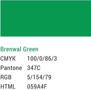
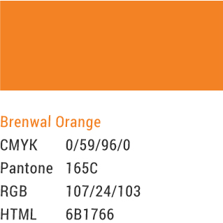
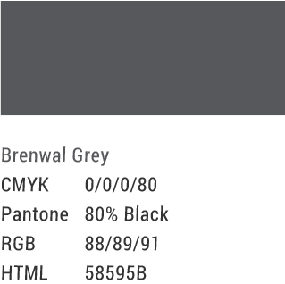
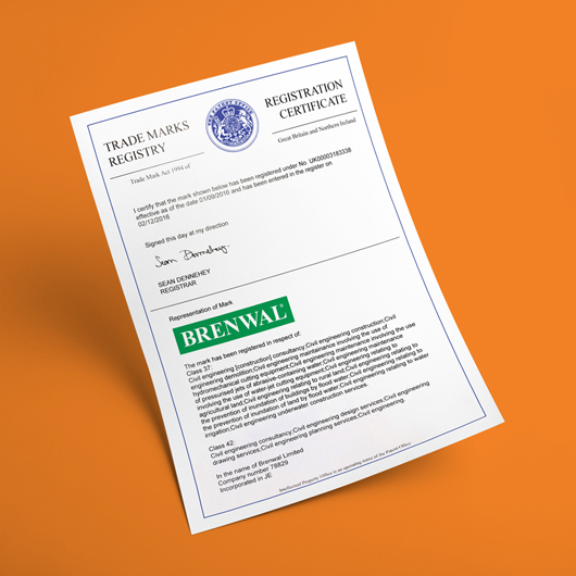
The next step was to refine and protect their logo. The typeface and kerning (space between letters) was adjusted and we submitted an application to protect their identity under Civil Engineering Classes 37 and 42. Their logo now proudly carries the registered trade mark symbol after being granted IP rights. Is your logo protected?

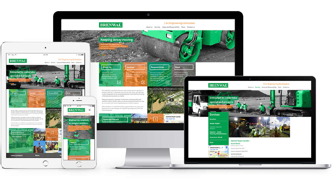
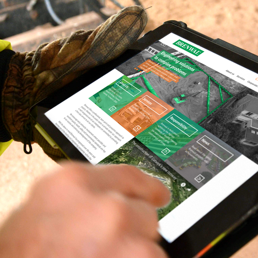
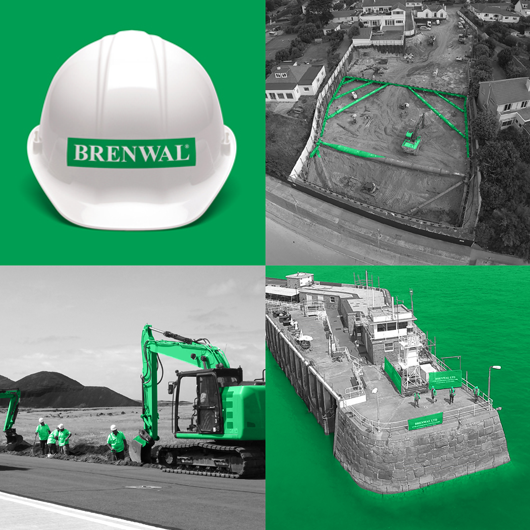
Phase 3 of the brand build was to put Brenwal’s ’starter’ website in the skip and commence construction on a site that responded to any device. The guys at Brenwal supplied us with a flash drive of photos, and you can imagine that images of drains, ditches and diggers are not the most glamorous. But with a bit a retouching blended with the new colour palette, we created a fine mix to help Brenwal stick in the memory of those who visit their website. Brenwal now proudly promote their website as a source of information. It helps to lay the foundations to build on new enquiries.
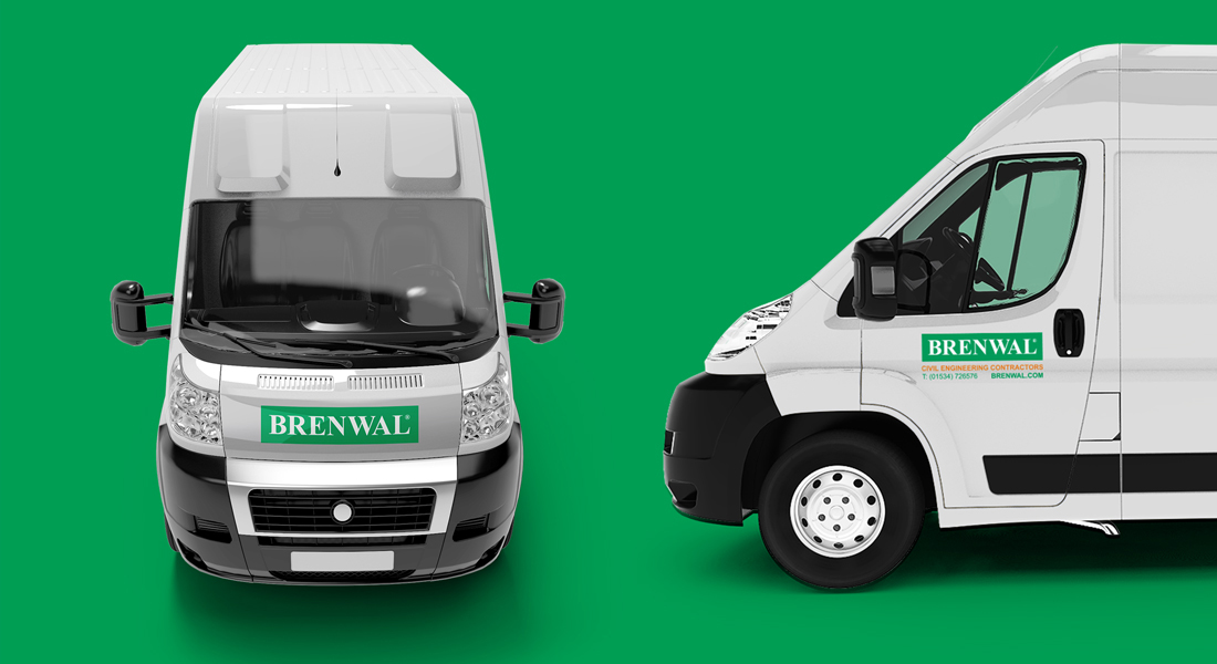
Brenwal are constantly out and about on the roads of Jersey and their green and white fleet livery is instantly recognisable. A brand identity doesn’t need to be complicated to be effective.
